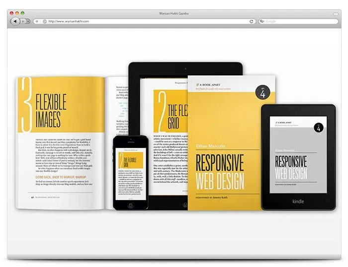
Simply put, responsive design is a technique for creating website layouts that adapt to different devices. Applying it lets a website display appropriately across the devices people use. In other words, the website needs technology that responds automatically to the user’s viewing choices.
Responsive web design accounts for differences in screen size, platform and layout orientation. Whereas websites were once mainly viewed on laptops or desktops, people can now visit them using the technology available to them.
If you plan to build a website, make sure your chosen web designer can create a responsive design.